Analytics Enhancements
Enhanced reports. Dashboard charts can now be configured with the following groupings:
-
Documents containing all of a set of pick list values across multiple fields (AND)
-
Documents containing at least one of a set of pick list values within a field (OR)
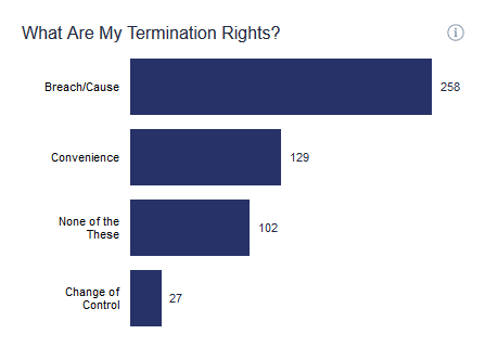
How can this help you? Knowable can group and display multiple fields from our standard data model within a single chart, such as termination for convenience, breach/cause, and change of control to show your overall distribution of termination rights.
-
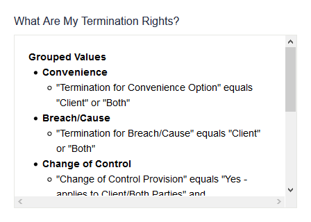
Interactive chart descriptions. When multiple dashboard filters apply to a chart, hover over the chart and click on an “i” icon in the top right to see the corresponding filters that apply (field names and values). Where chart values differ from a given data model field (e.g., our enhanced reports above), these are highlighted as “Grouped Values.”
For example, you can view the criteria applied (image below) for the termination rights chart above.
Minor Design Enhancements
-
Updated navigation menu

-
Search box location. The Search box now appears at the top of the Contracts table, ensuring you can quickly search without having to expand the filter pane.
-
Redesigned welcome email
-
New button color and styling
Comments
0 comments
Please sign in to leave a comment.